
This image is taken from the current digital issue of Womankind Magazine, to which I subscribe. The link to this issue is https://womankindmag.com/articles/wk34-courage/. The article is by Jacqueline Winspear, the photograph is Empire State Building by Lewis Hine, 1932. The magazine editor is Antonia Case. In this post, I will analyze this image in terms of basic design principles.
Contrast
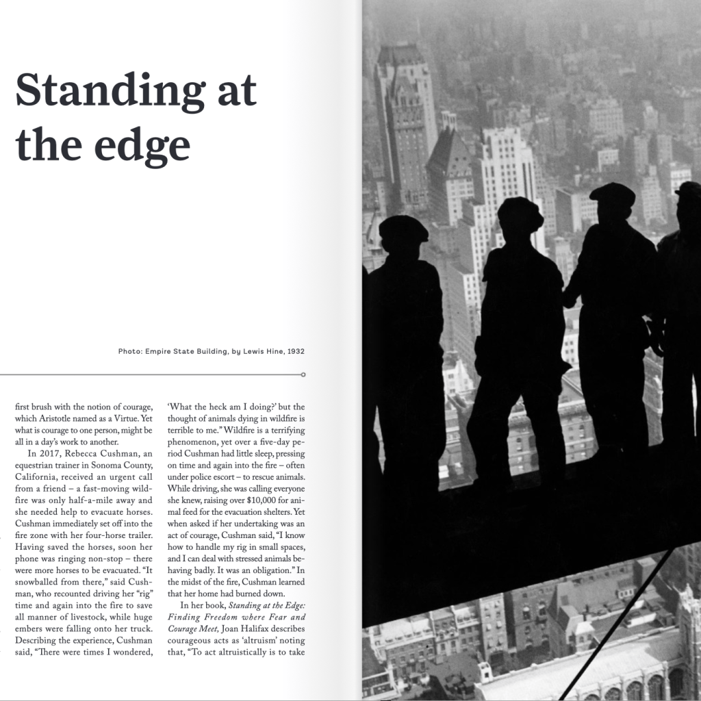
This spread in the magazine drew my attention immediately with the dramatic contrast in Lewis Hine’s famous photograph of construction workers standing on a beam high over New York City. The silhouetted human forms stand out sharply from the faded, softened cityscape. The black text on a clean white background with plenty of negative space contrasts with the photo as a whole.
Repetition
The diagonal lines in the photograph create a strong path for the eye to follow. This path is successfully extended in the layout of the text. These repeated diagonals keep the eye moving across the entire spread and impart a sense of anticipation and movement. In addition, the title “Standing at the edge” is a textual repetition of the image and links the text side to the photo side.
Alignment
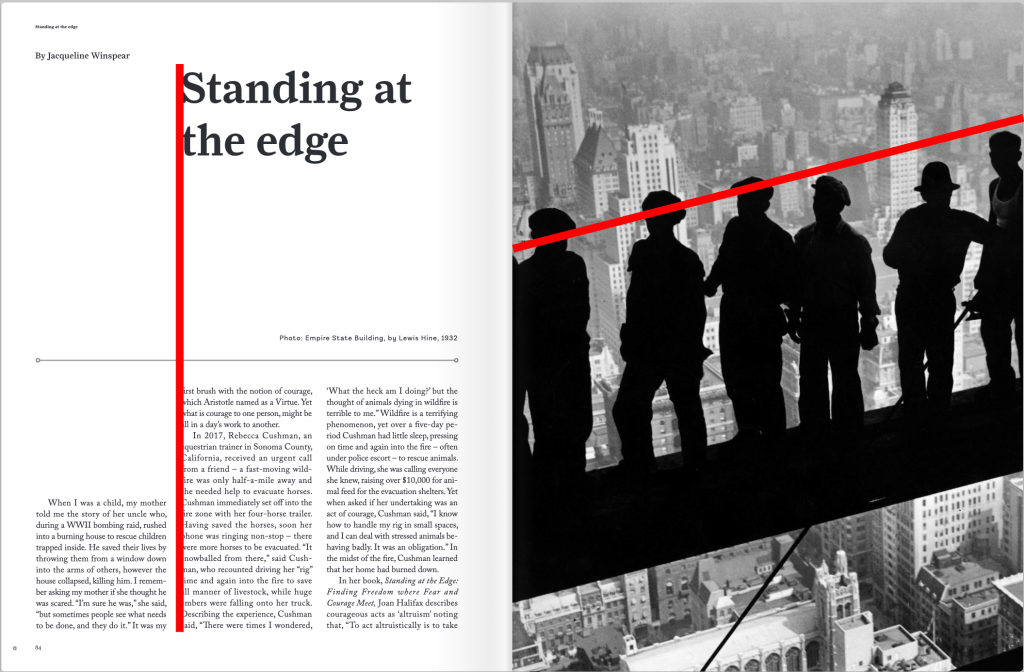
The alignment of the title with the second column of text ensures that the title doesn’t interfere with the author byline in the upper left corner. The alignment of the heads of the workers in the original photograph creates one of the diagonal lines that help make the overall image so effective.
Proximity
Proximity is used successfully in the original photograph to create relationship and interest in the silhouetted workers. And again, the magazine layout uses whitespace effectively (by choosing to keep the title distant from the text) to create the balance and contrast mentioned before. This is a great example of how the design principles work together.
Color
In this case, the best choice was to let the photograph set the tone and keep the whole layout monochrome. This lets the human figures be the element that catches the eye first while considering the interesting idea of “standing on the edge.”
Conclusion
This image caught my eye more than any other layout in the issue, which illustrates the power of minimalism in design. Color was not needed because of the good use of all of the other principles. The designer and editor did an excellent job of combining elements to make an effective visual introduction to the article itself.
