
This is a spread from the physical version of O Quarterly Magazine. It was scanned and stitched together in Photoshop by me. The magazine lists https://www.oprahdaily.com as the only website. Credit for the spread belongs to the editorial staff at the magazine, and the recipe is by Melissa Clark from her book, Dinner in One. https://www.melissaclark.net. No photographer is listed.
Typeface Categories

“Flash in the Pan” is written in a San Serif type. There are no serifs anywhere, nor are there thick/thin transitions or stress. The red draw-overs emphasize these features. The rest of the typefaces, drawn over in blue and green, are Old Style, identifiable by the moderate thick/thin transitions in the strokes; the serifs, which are slanted on lower-case letters and have curved bracketing; and the diagonal stress. The type in the upper right could be a decorative font because of the extreme thick/thin transitions, but it also passes several tests to be Old Style.
Elements of Contrast
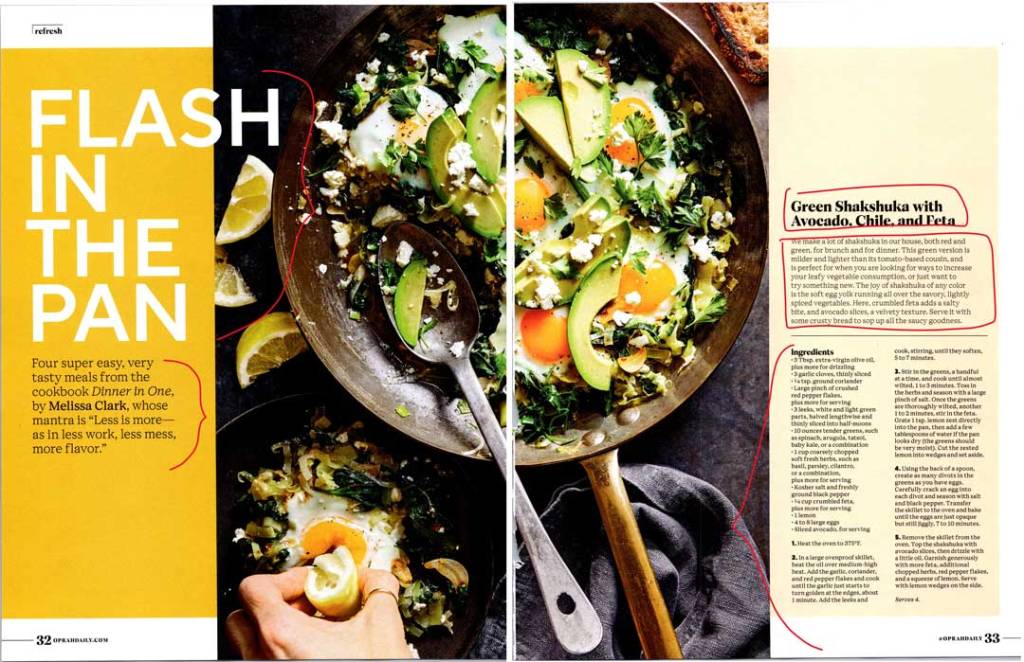
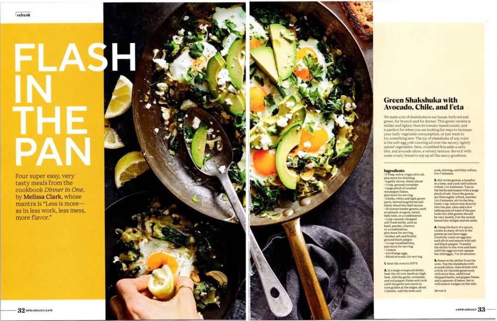
Flash in the Pan contrasts with all other typefaces in structure, style, weight, size, form, and color. The size of the drawn brackets on the left indicates size. The paragraph on the left contrasts with the recipe copy in size. The title of the recipe contrasts with all other typefaces in style, weight, and size.
Leading Lines
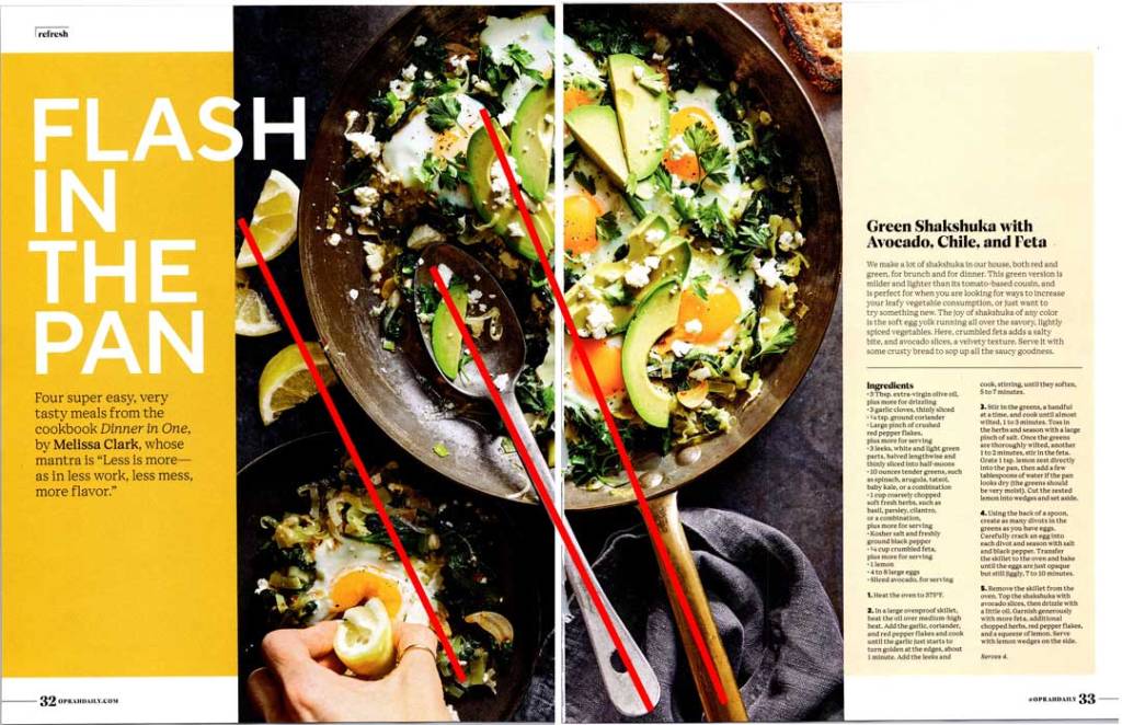
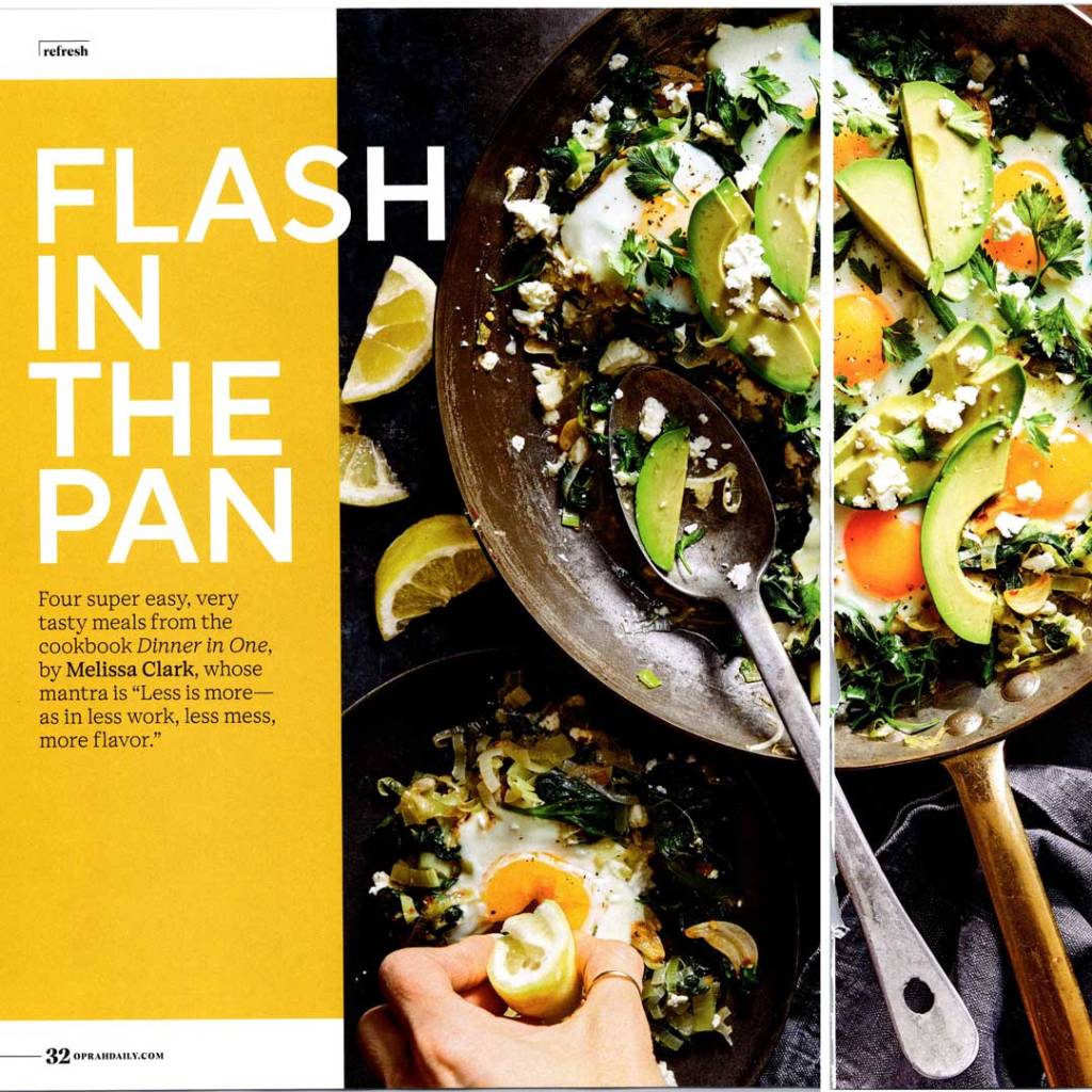
The photo makes good use of leading lines by the slant of the pan and handle and the assignment of the hand and the lemons on the left side. The red lines make these leading lines clear. This composition invites the eye across the food and to the title of the article.
Variations on a Theme
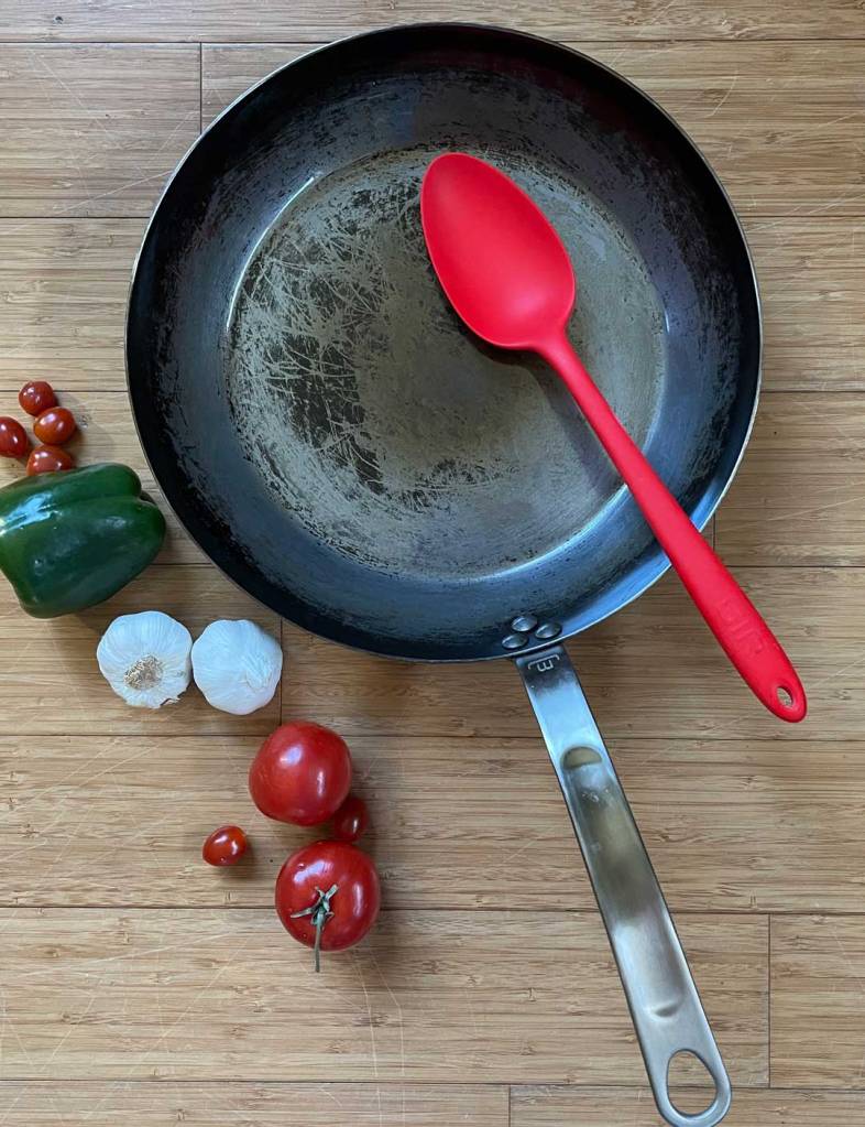


These photos all mimic the original photograph and use the same principle of leading lines. They keep the cooking theme and feature colors which either harmonize or contrast with the layout. There is space at the top for the overlap of the S and H from the word flash, and the leading lines would take the viewer’s eye up to the title of the spread. The leftmost photo was my first attempt and I immediately saw that more texture was needed.
Thoughts
This spread is dynamic and effective. The bright white headline and use of the word “flash” grab attention, then the textures and colors of the photograph invite the viewer in. The leading lines of the photo and the effective use of contrasting type keep the eye moving and reading. These elements combine and the spread accomplishes its purpose: the reader’s journey ends at the recipe.
