
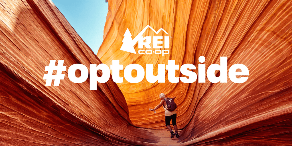
This image is from the REI #optoutside ad campaign, possibly from 2017. I found it here, in an article from Adweek. I cannot find the image anywhere on the web associated directly with REI, nor can I find the designer, but it shows up in multiple articles praising and analyzing this now-legendary campaign. The original photo is credited to Emma K.
This image draws the viewer in and is a perfect representative image from REI’s annual invitation to skip Black Friday and instead, #optoutside.
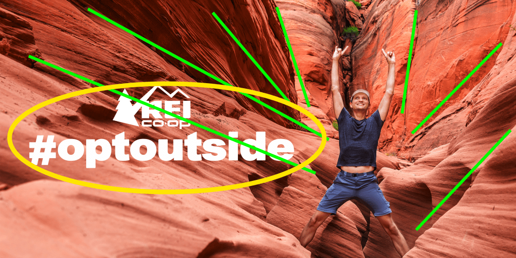
Design

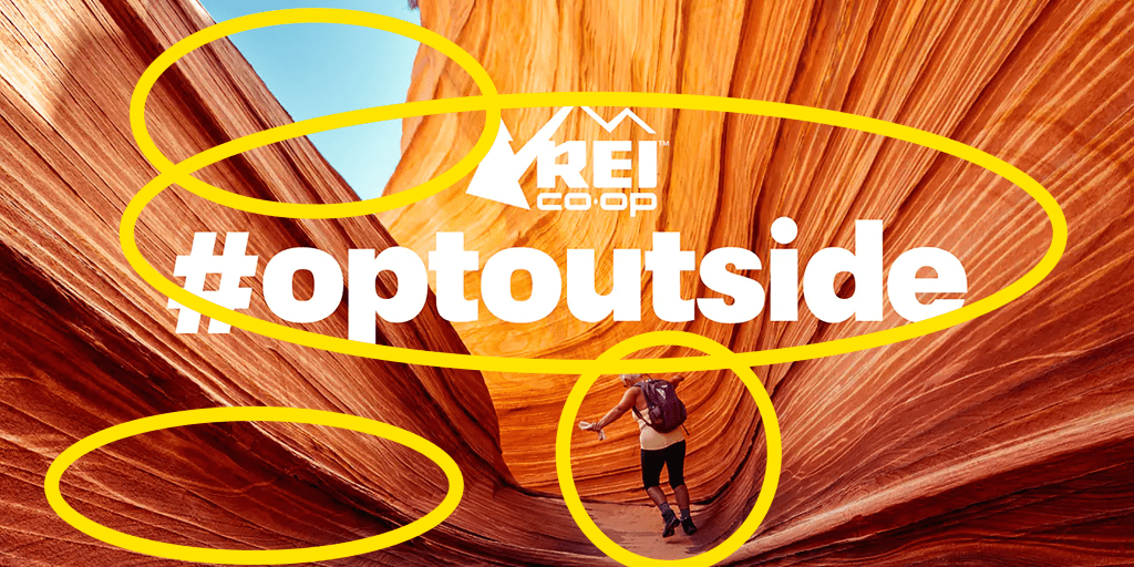
The strong simplicity of this design allows elements to do double-duty. The green lines indicate the repetition and alignment of the canyon walls. The setting was composed beautifully to lead the eye to the person in the middle. The yellow oval indicates how effective contrast and proximity connect the call to action with the person and the environment.
Color
Color-drenched with the iconic reds and oranges of southwestern slot canyons, this image uses the beautiful environment to best advantage. The black of the figure’s leggings separates her from the other colors. The white lettering and logo contrast with everything. The color of the sky gives a sense of motion and adventure by providing something to move toward. The dark-to-light of the canyon walls gives depth and dimension.
Typography

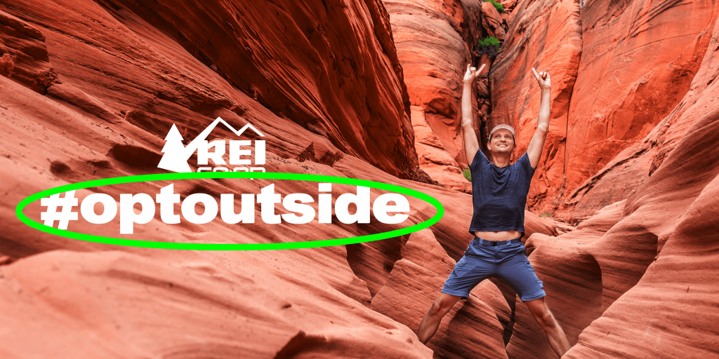
The typography is simple and instantly recognizable as the famous hashtag. It serves as a slogan, extension of the logo, and call to action all at the same time. The bold, San Serif font is a good choice because it keeps the focus on the message.
My Take
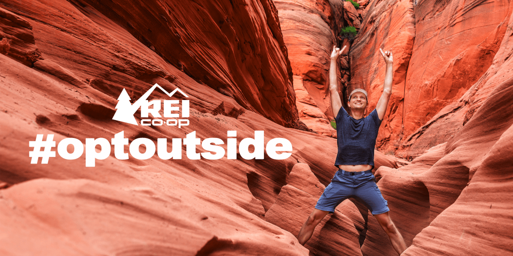
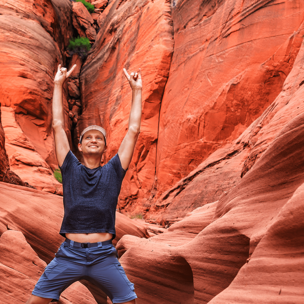
My version started with the elements of a person in a slot canyon, and uses similar colors.
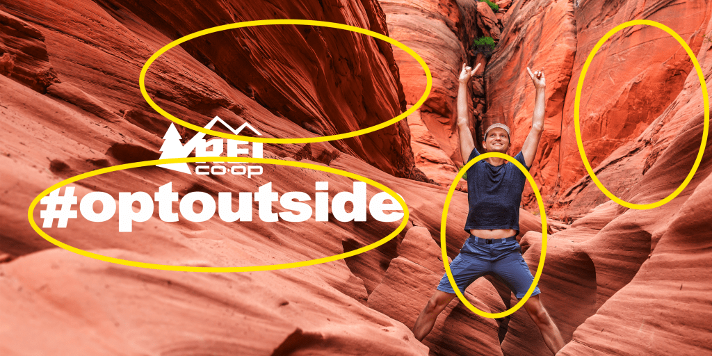
Design
Much like the original design, the slot canyon setting provided repetition and alignment to lead the eye to the man. I put the logo, typography near each other and the man in order to emphasize the branding, call to action, and the sense of inspiration created by the ad campaign.
Color
Color provides movement, texture, and interest. The bright tones are instantly recognizable as that of slot canyons, which are in turn synonymous with adventure and challenge. This fits into the general mood of the original campaign. The blues in the outfit of the man help him to stand out from the orange, and the white of the logo and typography contrast with everything.
Typography
Without knowing the exact typeface used in the original, I examined various other San Serif fonts, then played around with the size and spacing to approximate the strong, bold look of the campaign. I decided to use the original white because it was the best choice with all the colors.
Thoughts
This campaign has a lot of personal meaning for me. I never was much into Black Friday Shopping, but I now look forward every year to getting outside each year on that day. It has created strong brand loyalty in me, and these ads really do inspire me. I love the simplicity and focused intention. I believe my take on the ad would work well in the same campaign. It could be targeted to slightly different audiences but keep a consistent look and feel.
